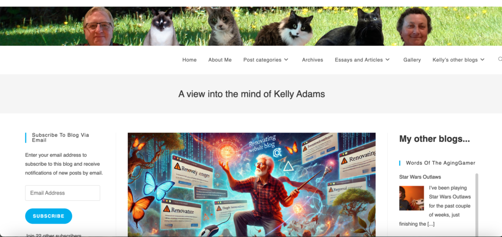
I’ve completed the site theme update as I mentioned yesterday. It isn’t completely finished: some things are still broken (sorry, macOS Safari users), and I’m not happy yet with some elements of the appearance.
But I did accomplish the main objectives I had. Ubergeek Kelly’s World is now using a more ‘modern’ theme that works with the plugins that were causing problems with the Twenty Fourteen theme I was using previously. And as part of the change I implemented the permalinks change (wth redirects from the old structure) I wanted to make. There are some additional details below for the ‘tech-curious’.
New theme= OceanWP; Broken with Safari
I experimented with a bunch of different themes, trying to find one that came close to the design I had with Twenty Fourteen. The main problem is that no one seems to like sidebars any more. I get it: clean designs are popular, and sidebars are sort of antithetical to simplicity.
But I like the sidebars for all the neat things they allow me to fit into a small vertical space. The left sidebar might have recent comments and a subscribe button, the right sidebar can have content from my other blogs, for example, and all of this can appear next to a list of my blog posts. I’ve become dependent on this structure on the main page of this site, and I wanted to continue with it.
I finally found a theme that supports two sidebars: OceanWP. Or at least it is supposed to allow two sidebars, but I tried everything and couldn’t get it to work. I even resorted to creating a forum post calling for help… before the idea of trying a different browser occurred to me. You see, I use the default macOS browser: Safari. I tried Chrome and voila: the sidebars appeared without a problem. Then Firefox: yep, there’s the sidebars. Darn.
EDIT: To clarify, the sidebars only appear on blog ‘list’ pages, not (presently at least) on individual posts/pages
E,g.: you should see the sidebars at https://www.kgadams.net (the main blog list page) but not at https://www.kgadams.net/sitenews/site-design-refresh-completed (an individual post- this one)
Safari: no sidebars

Chrome (also tested in Firefox): sidebars!

I tried deleting Safari’s cached data, completely restarting Safari, and even upgrading to the latest version of macOS (15.0.1) and the most current version of Safari (18.0.1): still no sidebars. I gave up just before 2:00 AM, deciding to stick with OceanWP for now on the assumption that (a) most people don’t use macOS Safari; (b) the OceanWP developers will fix the problem with Safari soon if I can prove to them that it exists.
Permalinks simplified: /category/post-title
Another of my objectives was to revise my site’s permalinks structure. The permalinks settings define the structure that defines the URL you see for a post: before the change, the structure I used was the default /<year>/<month>/<day>/<post-title> structure. This is the default structure WordPress uses, and is serviceable.
But I’ve had discussions with other bloggers (mostly during Blaugust) that suggest the default structure isn’t great for search engines. Google and friends prefer it when the URL tells you something about the topic of the post. So a better structure for them is /<category>/<post-title>: it also looks ‘cleaner’ for users. The problem, of course, is that changing permalinks can break any links that have been shared int he past- this is what stopped me from changing the structure in the past.
I found a WordPress plugin that ‘solves’ the link breakage issue caused by changing permalinks: Redirection. This plugin promised to automatically monitor your site for changes to the permalink structure and create redirection rules to make sure old links properly redirect (HTTP 301) to any new structure that is implemented. I tested this plugin on my other blog, Words of the AgingGamer, and it worked perfectly. It seems to work perfectly here, too. So I have implemented the new simplified permalinks structure.
Webmentions plugin now works
One of my ‘canaries in the coal mine’ regarding my previous theme’s compatibility issues was the Webmentions plugin. Webmentions implements the Indieweb ‘Webmentions’ protocol for WordPress sites, and I want to have it active. However, I had been forced to deactivate it after it broke the Twenty Fourteen theme’s comment reply functionality.
Webmentions works with the OceanWP theme without disrupting reply comments. I was pretty sure the problem was theme related, and it is nice to be proven correct. I’ve activated Webmentions again and hopefully my site can now be a proper participant in this aspect of the Indieweb.


I’m not seeing any sidebars in either Firefox or Chrome. There’s a big, black spider on the right side though, which is super-weird. Can’t click on it. It’s just… there.
Also, is the point size smaller? It seems like it. I can read it fine but I never used to notice it at all and now it feels slightly too small for comfort.
Interesting! Thanks for letting me know.
It is working fine with Chrome and Firefox for me, but I’m on macOS (thus the Safari observation). Are you on Windows, Bhagpuss?
I’m going to have to test on my wife’s Windows box now, I guess. Browser vs site compatibility issues: you’d think we were back in the 2000s 🙂
EDIT: I should clarify that the sidebars only appear on the ‘main’ blog with the post listings, not on individual posts
Yep, I’m on Windows. Win10 on my desktop and Win8.1 on the laptop I’m using right now. No sidebars on either machine, not on the posts or the home page. All the buttons at the bottom are fine. The laptop version has the font looking much larger. Not sure if that’s the change you made or just my laptop settings.
Thanks, Bhagpuss! I think I figured out the ‘problem’ and I posted about it here=> Missing Sidebars – Vexed by responsive design.
Basically, the left and right sidebars on the home page (with the list of posts) are being ‘hidden’ by the responsive site design due to the size of the browser window. I suspect there are some tweaks I can make to the theme settings to make this a little less likely to happen.
This behaviour can be altered by using the browser’s ‘Zoom in’ and ‘Zoom out’ capability i.e.: you you zoom in (making all the page elements larger) the sidebars may be disabled and vice versa.
Regarding font size: I thought it seemed smaller as well, but it says it is 14 points which is the same as the previous theme. That makes me think it is a typeface change that makes it look smaller.
I will do some tweaking today to see if I can make it a bit easier to read: my old eyes struggle with small fonts, so I’m definitely conscious of the change.
For me, in Firefox, the “Share this” and “Like this” items at the bottom of posts are now fully left justified to the full page rather than aligning to the margins of the post.
Thanks! I think that layout position is a conscious ‘choice’ by the theme developers: you can see that a few other elements are also positioned at the extreme edges.
But I’ll take a look: there are a ton of settings I can tweak, and I spent too much of my time in the wee hours of the morning trying to figure out why sidebars on blog list pages weren’t working.
Pingback: Missing Sidebars – Vexed by responsive design – Ubergeek Kelly's World- Life, technology, science, rants
Pingback: Making the OceanWP theme behave – Ubergeek Kelly's World- Life, technology, science, rants